Sunday, March 13, 2016

Gold Emblem cranberry nut trail mix


Gold Emblem cranberry nut trail mix is a CVS's brand. It functions as a healthy snack for those who want a mixture of sweet and salty with yogurt covered cranberries, dried cranberries, walnuts, almonds and raisins. This snack is intended for anyone, but is considered as a healthy snack therefore, the consumers who like fruits and nuts and are aiming to be healthy, to eat this. Trail mix was created in the first place as a healthy snack alternative consisting of zero trans fat. It is intended to be eaten anywhere at home or on the go. The color of the packaging, reddish brown is used to reflect the ingredients in the trail mix. The font is in black so consumers can clearly read what is the product. The material used to hold the trail mix is a light weight, but stiff plastic bag that can seal. Since launch Gold Emblem have produced more variety of trail mix and nut flavors. CVS producing their own brand line did not change the meaning of CVS store's purpose, but made a brand nut that is of similar taste to other brands and is much more affordable so consumers who want trail mix can think of trying and buying their product. 

The idea of CVS's own brand nuts is so that consumers can get variety and alternative of trail mix. The fact that some snack packaging materials cannot seal prompted the solution for seal bags. Therefore this design packaging is a good idea because with seal bags we can have our snacks everywhere we go without worrying that it will spill out and make a mess. And the fact that the packaging have a little clear opening allows consumers to see the actual ingredients inside the bag. The bag is also of light weight. Go out with trail mix!


Saturday, March 12, 2016

Ricola


Ricola is a brand popular for its cough suppressant and oral anesthetic drops in a variety of flavors like the image above, cherry flavored cough drops. It is like a hard candy with cherry, minty gel. It functions as a sugar- free candy that relief both your cough and sore throat. It is intended for those who wants to relief their cough and throat; not children under 3 years old because they might choke. Ricola originated from Switzerland, it was created in the first place because they wanted a sweet treat to have the affect of sweetness and pain relief therefore they created herbal and cherry drops. The package material used to hold this product heavy duty paper bag to keep the candies hard. The colors of the package consist of three colors red, white, and black to illustrate the two affects of eating this drop. The font is like arial, yet simple it is readable in three different colors. Ricola's since launch have changed their product line from producing sweets to sugar-free that is both sweet and effective for the throat. The creation of cough drop did not change the meaning of the company's production, in fact it attracted consumers to buy there product because they can have a sweet treat and not worry if it will harm the throat. 

The idea of Ricola's cough drop is so consumers can have a sugar-free treat that is both sweet yet can sooth the throat from pain. The problem that prompted a solution is the material of the package because a plastic bag can be easily heated verses a paper bag, a paper bag can keep the candy free changing form and effectiveness. This is a good idea. Moreover, Ricola could consider packaging a variety flavored cough drops in one package so one can share with other people so they can also sooth their throat and sooth their cough. 


Sunday, March 6, 2016

Private Selection Cafe Con Leche


Private Selection is a brand offering consumers with premium artisan experience. It is a brand producing products ranging from bakery goods, beverages, dairy, deli, floral, frozen foods, meats, produce, sauces, grains, seafood, snacks, spreads, condiments, and dressings. One of the frozen foods is gourmet ice cream like the image above, Cafe con Leche. This ice cream functions as "the freshest and richest ice cream" made out of Columbian and Brazilian coffee, caramel, and white leche cups (chocolate). This ice cream in particular is for those at any age, who likes the combination of coffee, caramel, and chocolate. Ice cream was created at first as a frozen treat eaten as a dessert or snack to be eaten in the warm weather to cool down the body, but now it is treated as a treat that can be eaten as a dessert after a meal or by itself as a treat. It is intended to be eaten where ever, but ice cream should be kept in the freezer because it will melt easily. The material chosen to hold the ice cream is heavy ice cream carton for durability because carton is does not easily break. The color of the carton is dark brown and black depicting the richness of the flavored ice cream picture and label. The font is elegant showing the brand of ice cream is of high quality. Since launch, Private Selection have added more gourmet flavors to their ice cream collection. 

The idea of this ice cream package is to let consumers acknowledge that their brand is of high quality compared to other brands, to attract consumers. Before ice cream brands only produce only one sized ice cream cartons, nowadays, ice cream brand produce a variety of sized ice cream cartons so consumers can choose what size of ice cream to eat and for which occasion. There is also to go sized carton that consumers can buy and bring along with them whenever they crave for ice cream. In the carton, there is also a tiny folded spoon attached to the cap of the ice cream carton so consumers don't have to bring or buy separate utensils to eat their ice cream. This design of ice cream is a good idea. 

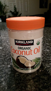
Kirkland Signature Coconut Oil


Kirkland signature Organic Coconut Oil is a original brand produced by Costco itself. Coconut oil is meant to be used for cooking. It is intended for everyone to use. Coconut oil was created in the first place as a enrichment to the flavoring of food, but nowadays coconut oil is used in many ways besides cooking, it is used for skin, weight loss, and overall for health boost. It is intended to be used indoors at home or restaurant, preferably in the kitchen because oil needs to be kept in a certain temperature and can easily turn bad when exposed to the sun. A plastic container was chosen to hold the product because a plastic container is lighter than a glass container. The color chosen to display the product is bright orange is to attract consumers to buy their product. The label with a background, organic font, and a picture of a split coconut laid on palm leaves depicts where the coconut oil is extracted from, is natural. Kirkland signature since launch has evolved by providing consumers with "perfect combination of quality of food and supplies and price". 

The idea of this coconut oil packaging design is to provide consumers with a good quality coconut oil made from nature. The design problem that prompted this solution is that Costco do not want to count on other brand's coconut oil to gain customers, they want to provide their customers with their own brand of goods therefore Costco came up with Kirkland Signature. This is a good idea because coconut oil can be expensive and by Costco producing their own coconut oil can help them gain more customers joining their Costco membership. Coconut oil is not only tasty, but healthy to one's skin and health. 

Sunday, February 28, 2016

Mission Organics Blue Corn Tortilla Chips


Mission is a food brand well known for its flour, corn, whole wheat, artisan style tortilla, tortilla chips, wraps, tostadas, taco shells & kits, and salsa & chips. Like the image above, mission organics blue corn tortilla chips. Tortilla chips can be eaten alone or as a dip, dipped into salsa or cheese dips. It is intended to be eaten anywhere on the car, outside in the parks, or at parties. The materials used to hold the chips in is hard plastic paper bag. The color of the package consists green and brown paper bag. The color green used means refers to the chips made out of organic ingredients just like the corns used to the chips. The font is simple yet bold so the product is visible to consumers. Mission food since launch has changed by making more tortilla products bringing consumers the "authentic taste of Mexico's staple food". 

The idea of the blue corn tortilla chips is that consumers can have another selection in chips. To provide consumers with the originality, natural ingredients of corns in chips. The blue corn chips is launched as the product in the organic line in 2012 because eating healthy is what people are aiming for now. 

El Camino Real Bakery Organic Simply Clusters


El Camino Real Bakery's Organic Simply Clusters is a fruit, seeds, and nut clusters. It functions as a no baking required treat that can be simply made in less than twenty minutes. It is intended for those who are not in the mood to bake stuff, but wants to eat baked home goods. It was created in the first place in considerate of consumers who do not have a baking oven or do not have enough time to bake goods to create a treat within twenty minutes by just mixing up the ingredients in the bag. Actually this product is intended to be eaten anywhere because it can be simply made with a foil paper or plate. The material of the bag chosen to hold the clusters is to keep the clusters fresh, crunchy, and can be eaten at later times. Its hard paper plastic bag keeps the clusters from easily turning into crumbs. The package consists three colors orange, black, and white; orange was chosen so the product can be visible, white to highlight the product itself and black to highlight the white fonts listing how much the package weighs. The font is simple yet bold so the consumers can clearly read what the product is inside the package. Since production, El Camino Real Bakery change its product name from Simple Bites to Simply  Clusters because instead of bites, clusters is a another name for a grouped ingredient food, it highlights the product's ingredients.

The idea of this product made is so consumers can have a home made treat within less than twenty minutes with no required baking. The design problem that prompted this solution is that not that many people have time to bake goods therefore clustering the ingredients together to make a treat without baking will lessen allow the consumer to spent less time on making a treat without consuming all their valuable time. It is a great idea because not all people know how to bake, but they can now have a treat like its homemade.


Sunday, February 21, 2016

Forever 21 Contrast-paneled hoodie


Forever 21 is a popular clothing brand amongst those in their mid teen years through early twenties, but there are consumers of older age who likes to shop there. In the image above is a contrast-paneled hoodie in black and white. This hoodie in particular is intended for anyone to wear. It was created to be a comfy and warm wear. It is intended to be used inside or out. The color of the hoodie was chosen to highlight the body, but in a low profile way. Although the hoodie is not one hundred percent cotton, the material used is to make the hoodie lightweight end and comfortable to wear. Forever 21 since launch has not changed their company's original meaning of providing consumers with fashionable and comfortable clothing of all kinds.

The idea of this hoodie is good because we can wear it by itself as a hoodie dress, a hoodie to conceal the heat of our body from the cold and as a complimentary to our outfit. Long hoodie nowadays is in fashion trend. It is a great idea because a long hoodie can hide the imperfections of one's body And stay comfortable at the same time. Comfortable is the key to a wearable clothing.

PRISMACOLOR color pencil


PRISMACOLOR is a professional art supply sold in retail craft stores like Dick Black Art Material, Michaels, and swains. Their art supplies ranging from colored pencil, pastel, charcoal, and many more. The colored pencil in the image above function as a high quality colored pencil of pigmented colors smooth and rich colors. It is intended for students who is taking art class, majoring in art, and professional artist or designers of any kind. At first colored pencil was created for checking and marking things, but later produced as an material for art. It is intended to be used in or outside, anywhere one likes, but preferably at the work station, table, or studio because of the sharpness of the pencil. The colors of the colored pencil of this particular colored pencil pack was to provide consumers with 12 brilliant colors consisting the primary colors, secondary, complementary, and achromatic colors, the basics of color. The colors are packaged in a metal tin box. PRISMACOLOR since launch has upgraded their supplies by providing consumers with a variety of textured colored pencil to be used on different surfaces and materials.

The idea of PRISMACOLOR colored pencil is the high quality, professional, and pigmented colors. The colored pencil is packaged in a tin slim box to protect the pencils from breaking and the colors from falling out so easily. This fortunately is a great idea because developing artist can use the colored pencils for a long time, that is worth for the price. Because a pack of PRISMACOLOR can last you a long way through your educational or professional path.

Saturday, February 13, 2016

JANSPORT Backpack


JANSPORT is a brand well known for its backpacks. In the image above, this backpack functions as a five compartments backpack with a side net pocket for water bottle. The compartments are made specifically for one to put their needs for school. A backpack is called a "backpack" because it is meant to be carried on one's back and for it to not fall there are two straps one can strap over their shoulders for secureness. Backpacks are intended for anyone, but mainly for those who go to school. It is intended to be used anywhere because one can carry it anywhere they go. The material of the backpack is either nylon or cordura because the fabric is somehow light and waterproof compared to cotton. The color and patter of this backpack is not too extreme, it's calming to the eye. Jansport backpack was created in the first place as a pack for outdoor activities. The brand has evolved since production because of the many fabrics and style bags selection consumers can try out. No the changes made did not change the original meaning of backpack, but more thoughtful, consumers can choose one compartment or more than one compartments to store their needs.

The idea of Jansport backpack design is "making travel easier, lighter, and hands free". People do not have to carry their stuff in their hands,nether can just put it in their backpacks and go. The idea of a the creation of backpack is good. Nowadays, because of the digitally transformed world, Jansport and other brand backpacks made pockets specifically laptop and iPad. This is so consumers can carry all their stuff in one backpack and not have to carry more than one bag. Travel in one hands free!

Coach Snoopy Handbag


Recently Coach have pushed out their brand new Coach collection collaboration Coach x Peanuts, like the image above. It functions as a shoulder bag. This collaboration of Coach x Peanuts is intended for consumers from young adults and Snoopy fans. It was created at the first place to bring out Coach's playfulness of creation. It is a shoulder bag therefore it can be used anywhere because it can be strapped to you. The material and color used to make this bag is red leather. Although this bag is made out of leather unlike other leather bag brands, it is lighter and not overwhelming to carry on the shoulder. This design of bag offers consumers with a new selection of handbag different from Coach's classic handbags that runs the luxury line. Coach has changed and evolved since production by providing their consumers with a variety selection of handbags from classic to prints to floral to playful like the collaboration of Coach x Peanuts. This evolvement did not change the meaning of Coach because even though Coach have pushed out a variety of designed handbags, their bags still look high class and luxurious like their brands logo. 

The idea of Coach's creation of the Snoopy collection is to bring in the young consumers to buy their products. To make bags not only useful, but as an playful and colorful accessory wearable with any outfit. There was not any problem that prompted this solution, is it just that Coach wanted to create something extraordinary to attract the young consumers. It is a good idea because when young consumer sees it they will be attracted to it and also the snoopy plus peanuts fans. 

Sunday, February 7, 2016

Coach Poppy Wildflower Perfume


Coach is a luxury brand known for their men and women leather bags, accessories, footwear but little do we known Coach also sells fragrance like the image above. The fragrance above is Coach's Poppy Wildflower Perfume. Perfume functions as one of the body care not inseparable for women, perfume allows a woman to smell good and look confident amongst people. The perfume is intended for women in their late 20s through late 50s. The perfume was create to represent coach like when you walk into a Hollister or Abercrombie retail store, you always smell the fragrance in the air; and when one smell that fragrance outside of the store they will ultimately recognize the fragrance and its origin. This perfume is particularly made for one to use at home before you head out. The material used to hold the perfume is a a glass bottle, like a spell bottle. The font Coach chose to use is Ecuyer Dax in the color gold, the font and the color combination reflects the idea of elegance. In addition, the bottle cap tied with a red violet fabric imitation of a poppy wildflower makes the perfume even more special. Coach has changed since installation from only producing hand held products like wallet and billfolds to a company that produce leather bags to watches to perfume. Coach never changed their company's original meaning, but expresses more of their meaning through producing more hand crafted leather products. 

The idea of Coach's Poppy Wildflower perfume is the elegance of flower. The design is simple yet luxurious. The design is good. The imitation of a poppy flower in fabric tied to the bottle cap allows consumers to vision that they are really holding the real flower. Moreover because this perfume is held in a glass bottle it can't be used anywhere but at home. It will be better if Coach made a travel sized version of this product with a different material container. So we can carry our favorite perfume without worrying that it will break any moment. 


Origins Skin Care Products


Origins is a cosmetic brand developed in the 1990s by Estee Lauder's son Leonard Lauder. Origins is brand known for its natural skin care products. Products ranging from moisturizer, cleaners, soap bars, fragrance, to even candles. It functions as a organic product for skin of all types including sensitive and problematic skins. Products that are made through a collaboration with dermatologist Dr. Andrew Weil. Their products are intended for "millennials" meaning for people who are reaching young adulthood who are in their 20s through 40 years old. Most cosmetic products are preferred to be used at home like the origins products in the image above. Origins "Modern Fiction" is a exfoliating cleanser that removes dead skin cells from the skin outer surface so the skin can feel soft and bright. The other two are Origins masks. Origins "Out of Trouble" mask is to be used to rescue problem skin in 10 minutes. Another mask is Origins "Drink up Intensive" unlike the Out of Trouble mask, this mask can be kept on an individual's face throughout the night in bed, it moisturizes your skin while you're sleeping. The material, colors, and font of the product chosen is to reflect natural because green symbolizes harmony and freshness. Origins logo is trees, trees representing the life cycle, that our skin cycles too. Our dead skin cells need to be removed so we can produce new skin cells to protect our inner skin surface from harm. Since launch Origins evolved from organic line of skin care to campaigning global pollution defense. Origins changes did not change the brand's original purpose.

Origins product design idea is that beauty comes from nature. The design problem that prompted a solution is that Origin find that there are people with a severe skin condition, so they want to be able to help those people by making a line that is free from polluting our atmosphere because pollution can do damage to our skin. Origins design is a good idea. Their products screams out natural, fresh, and environmentally friendly. This is a type of brand an individual can go to if she or he want to refreshen their skin from dull to bright, from dry to moisturized, and from problematic to carefree!


Sunday, January 31, 2016

Cetaphil Moisturizing Lotion


Cetaphil is a skin care brand. Their product is gentle to be used on all skin types. They have several skin care lines from moisturizers, cleansers, acne prone & eczema, to baby.  It functions as a dermatological treatment product that consists of three free: scent free, oil free, and chemical free. It is intended for anyone: baby to children to teens to adults to seniors. It was created in the first place to treat people who have skin problems from dry to irritated to acne. Cetaphil's product is mostly intended to be used at home before or after you shower. But there are little versions of the products that serves as the purpose for traveling. Cetaphil chose plumbing plastic tube, jars, and pump containers to hold their products because the lotion would not spill easily. The colors white, blue, and green to make their skin care brand look like a professional dermatological formulated product prescribed by your dermatologist. The brand name is in negative space and in a font that is simple, bold, and easily read. Cetaphil since launch did not changed their product's purpose. 

Like the lotion in the image above, the idea of the product's design is to insure consumers that their product's formula is approved by dermatologists. The design have no problem. Their design is simple, but screams medication for skin. Cetaphil making their product in travel sized packaging, allow consumers carry the particular product they use daily to any destination whenever they feel like their skin needs to be treated. Overall their product design is good. No matter friends or family recommend that an individual should use Cetaphil because they can really see the difference in their skin. 

Soylent vs. Meal


Soylent is a brand drink known as a meal replacement beverage like Special K's chocolate protein breakfast drink. Soylent unlike ordinary soymilk does not have any flavor, but is very nutritional. It is mainly intended for adults so adults can get their daily nutritional intake. It was created in the first place to get people to stay off of kitchen and restaurant food, as a diet drink. It is intended to be used day and night, three times a day because it serve as your meals. Although soymilk is white, soylent decided to use a plastic white bottle to hold their product. The font was chosen to state the name is in black and is simple. Since launch soylent has not changed their purpose, but made it more beneficial and convenient for consumers. Before soylent was sold in a plastic package as a powder, but because of convenience, soylent has created a already mixed beverage so consumers can have it on the go without forgetting to make their drink.

In the image above, you can see that soylent is a billboard advertisement and not the actual product. But as you can see, the design packaging of soylent is very simple. The white plastic container represents the whiteness of the beverage. And the background of a galaxy to indicate that drinking their drink, you will feel light, but also considered as the "easiest meal" to have. The billboard advertisement is good. They have incorporated the usefulness of positive and negative space. The white of the product being the positive space. In addition, the background contrasting the color of the product really helps the product catch the viewers attention. The billboard is very effective because we can see it clearly see the product and the brand's name advertised from a distance. If you want to lose weight but gain all the nutrition, soylent is a easy meal you can have.

Sunday, January 24, 2016

Silk Unsweetened Organic Soymilk


Silk is a brand well known for its many variety flavored milk as well as soy milk, almond milk, nutchello- a nut based beverage, yogurt, and creamer for your coffee. It functions as a healthy drink with no artificial colors, no artificial flavors, no high-fructose corn syrup, dairy free and has 50% more calcium than ordinary milk. According to Silk, "It's tastier than milk. People with taste buds said so". It is intended for a people of any age to drink, to start their day with a healthy drink. It was created in the first place as a dairy free milk in 1978. It is intended to be drank in the morning as part of your breakfast meal, but now it could be as an ingredient added to make your smoothie, soup, meal, or dessert. The material chosen to hold the beverage in a paperboard milk carton. The packaging is color coded, like the image above, Silk's beverage packaging in dark turquoise represents unsweetened soy milk. The font Silk in bold cursive highlights the brand's name, the planted- powered protein in red fonts and with the heart allow the consumer to acknowledge that this product have health benefits And the splash color of white represents the milk. The product since launch has not changed their purpose, all along they went along the line of producing consumers with dairy free and healthy products. 

Silk's idea of color coding their products is helpful because consumers is able to determine how sweet or what flavored drinks they want based off of their health conditions and healthy habits. And the splash of milk poured into the glass cup makes the consumer want to buy their products because it makes them thirsty. Therefore this is design is good. The milk being held in paperboard milk carton better than other material because it harder break and spill easily. The brand also created small packs of their beverage product so consumers can have their favorite drink on the go without having to carry a big carton. 

Saturday, January 23, 2016

Special K Fruit & Yogurt Cereal


Special K is a popular brand known for its low calorie, but flavoring cereals. Aside from cereals, Special K in these recent years has presented consumers with cereal bars, breakfast sandwich, and chips. Special K Fruit & Yogurt Cereal, in the image above, is made of crunchy rice and wheat flakes with clusters of oat, fruit, and yogurt. In many commercials and advertisements, we see Special K cereal functions as a "tiny breakfast that helps us weigh less...what will you gain when you lose?" It is a cereal meant for those who want to eat something healthy, delicious yet lose weight. This cereal is intended for adults, mainly targeting women in their early 20s-mid 40s. It was created in 1955 that marketed as a low fat cereal. It is intended to be eaten at home in the morning, as breakfast. The material used to hold the cereal is a heavy duty plastic bag and a paper box. The color of the boxing refers to the mixture of fruits and white yogurt used in the cereal. The letter K is in a large and bold font to illustrate specialness and strengths of the cereal, while fruit & yogurt in white fonts screams healthy. The brand did not change its purpose since launch instead it have evolved since its installation. The brand has expanded through presenting their new products other than cereals to consumers by broadening their perspective of food, that things they eat can be low fat and flavoring at the same time.

Special K's idea of the packaging design is simplicity and healthy. Their product's packaging shows the ingredients used in a bowl of cereal. They want their consumers to be able to visualize the cereal without assuming what their breakfast will look like because a picture tells all, whether or not the cereal is good to eat; and because Special K used plastic bag, the cereal would not fall out easily and paper box to keep the cereal from crumbling. Therefore, it is a good idea. Furthermore, the brand has also created a bowl sized packaging of their cereals so consumers can have their favorite cereals on the go.


Sunday, January 17, 2016

Lindt Lindor Dark Chocolate


Lindt is a popular brand famous for its delicious melting chocolate truffles. Rodolphe Lindt the creator of Lindt's chocolate was one of the most famous chocolate makers in the late 1800s-early 1900s. Back in the days chocolate was served as a drink, hot chocolate, flavored with a mix of peppers and spices, served to those of nobles. Then in 1845, Lindt decided to make chocolate into a solid form, into a candy bar that ordinary people can buy. In 1949, Lindt introduced people to Lindt Lindor, a chocolate ball filled with melting chocolate inside. The creation of Lindor was "inspired by a heritage of chocolate making, Lindt's Master Chocolatiers created a chocolate masterpiece, the iconic Lindor recipe. The delicious Lindt chocolate shell enrobes an ultimately smooth filling. Once the shell breaks, the irresistible and decadent filling starts to melt". The functionality of chocolate has changed. Nowadays, people indulge on chocolate especially dark chocolate for healthy reasons, because eating dark chocolate can improve one's brain functionality and can reduce the risk of one having a cardiovascular disease by lowering cholesterol.

Chocolate is intended for anybody who craves it. Unlike chocolate bars, the chocolate balls are wrapped separately from its package. The chocolate balls is wrapped in blue foil papers. The material of the package is of a blue poster paper textured bag with intricate white snowflakes and leaf vine. In the middle of the package is a cut out with clear heavy-duty plastic wrap, so consumers can see the nicely wrapped chocolate balls. The package’s brand Lindt is in gold cursive whereas Lindor and dark is in white font. Yet the fonts used are simple, it screams one of a kind hand crafted chocolate. The idea of the design is to get consumers to indulge in their rich and smooth dark chocolate. In addition, the packaging idea is good because the bag is thick enough to keep the chocolate in form and not melt easily. Lindt's Lindor dark chocolate is delicious. 

Saturday, January 16, 2016

Kleenex box or go pack


Kleenex is a brand well known for its soft disposable tissue. Soft enough to use to wipe our face, when we have a running nose to teary eyes to dirty mouth, our hands, and anything. It is intended for the human population to use at no matter what age. "Kleenex Tissue was first introduced in 1924, when a package of 100 sheets sold for 65 cents. Although it was originally marketed as a cold cream remover, people used the tissue many other ways, especially as a disposable handkerchief. In 1930, advertising was changed to reflect this usage, and today more people buy Kleenex Tissue than any other brand". This was how disposable tissue was created. It is intended to be used anywhere, whether at home or on the go. The materials used carry is a disposable box, so when one is done with the box of tissues, he/she can dispose it. The font used is Montauk Pro Bold, in white, it shows that the Kleenex is a special type of tissue. The colors and patterns was chosen to express freshness, cleanness, and environmental friendly as well as a sort of decoration that one can place anywhere whether in their home or car. Since Kleenex has launched, it has changed its products purpose and functionality from cold cream remover to a many purpose disposable tissue.

The product's size and packaging was the issues that prompted a solution to create small packages of the disposable tissue, shown in the image below. Instead of using a paper box, Kleenex used disposable plastic bags. This was called the Kleenex go pack. The Packaging is of lightweight and small so it can fit in people's pocket, purse, and backpack without taking up all the space. It was a great solution that allowed consumers to carry tissue with them on the go. The solution was very effective, as seen since the flu outbreak in 2013, people started carrying around with them packs of tissues and hand sanitizer to protect themselves from getting the flu. And to use it to maintain a clean appearance and a clean environment. This is a product that anyone can have that comes in handy whenever and wherever.


Sunday, January 10, 2016


Napa Valley is one of the tourist attraction famously known for their many wineries, Robert Mondavi Winery being one. In the image above is a bottle of wine created by Robert Mondavi's winery named Merlot, 2011. It is a alcoholic beverage made out of ripe blackberry and plum. Back in the days, wine was known as an expensive and valuable drink, only drank on special occasions. However, the function of wine has changed throughout the years. Nowadays, wine is used for nutritional benefit, to complement food, and as a drink for healthy lifestyle. At first, wine was intended for noble class man, but now it is intended for both men and women, of legal drinking age, 21 and over. It symbolizes fine life, used at all sort of occasions whether formal or informal, at events and parties, or during dinner. 

The color of the glass bottle being black, was chosen to represent the richness of the wine. It's label background being white shows the pureness of ingredients used. While the fonts for the winery and wine name shows the luxuriousness of this beverage, as well as where it is from in a red cursive font, elevates the cost of the wine. The label also shows a picture, hinting how the winery looks like, allows consumers to vision what it will be like drinking at the winery. In the image below, Robert Mondavi Winery is engraved on the cap of the wine bottle with the color gold, reflects that his wine is a divine design. The idea of this wine bottle design is to present to people that this wine stands among the world's finest winery. The design idea is good, yet simplistic it shows the upscale of a alcohol beverage. However, because it is held in a glass bottle it can break easily. A protection sleeve incorporated into the design can be great and durable for consumers. 


Friday, January 8, 2016

Bath & Body Works Travel Sized Body Lotion


Bath & Body Works is a popular brand when it comes to fragrance, lotion, freshener, candles and more. On the top are some travel sized scented body lotions. The travel sized body lotion was created so that consumers can use their favorite body lotion without having to bring the normal sized bottle; moisturize their skin and smell good at the same time while on the go. This product is intended for both male and female, but mainly focusing on female's needs. Because the body lotion is in travel sized, it can be used anywhere. Bath & Body works use plastic bottles to hold their product, it is so the lotion won't break and spill easily. And because it is held in plastic bottles it is light weight. The product's designs and colors are designed to represent a particular scent. Bath & Body Works also use a various types of font to declare their products, based on the scent, popularity to special scents. The change of Bath & Body Works in making a travel sized body lotion have made it convenient for consumers. 

The idea of a travel sized body lotion being made is really generated to the idea of convenience. The product's size and inconvenience are design problems that prompted the solution for Bath & Body Works to make a change in their product's size, making it smaller and portable. It is a good idea. Furthermore, a hangable travel sized body lotion like the brand's hand sanitizer can make it even more convenient for consumers to use, making it one of the essentials handy for consumers.